Journal
How to Style Photo Frames Without Making Your Walls Look Like a Storage Unit
How to Style Photo Frames Without Making Your Walls Look Like a Storage Unit
Walk into any Australian home built in the last twenty years and you will find at least one wall that looks like a lost property office. Frames of different sizes, different colours, different eras, hung at different heights with no relationship to each other or to the room they are in. The intention was personal. The result is chaos.
Frames are the most misunderstood objects in home decoration. People treat them as containers for memories. They should be treated as design decisions.
The Problem With Most Frame Displays
The average Australian home has frames from at least four sources. A wedding photo in a silver frame from Myer. A child’s drawing in a cheap black frame from Kmart. A print from a market in a natural timber frame. Something from IKEA in a frame that was on sale. None of these frames were chosen to work together. They were chosen individually, at different times, for different reasons.
The result is a wall that tells you everything about the shopping history of the household and nothing about the people who live there.
The fix is not to buy matching frames. Matching frames create the opposite problem. A grid of identical frames looks like a hotel corridor. It is orderly, but it is dead. The fix is to choose frames with intention, the way you choose furniture. Not as afterthoughts, but as decisions that affect how the room reads.
Choosing Frames That Have Something to Say
A frame does two things. It defines the boundary between the image and the wall. It sets the tone for what is inside.
A thin black metal frame says something different from a thick oak one. A brass frame says something different from a painted timber one. These are not neutral choices. They are part of the visual language of the room.
For Australian homes, timber frames work particularly well. They connect to the materials that define Australian architecture. Spotted gum decking. Blackbutt flooring. Federation-era fretwork. A timber frame in a room with timber floors creates a conversation between the objects on the wall and the surface underfoot.
Metal frames, on the other hand, work in rooms with harder materials. Concrete floors. Steel window frames. Rendered walls. The metal picks up the industrial language of the architecture and extends it vertically.
The mistake is mixing both without a reason. A timber frame next to a brass frame next to a painted frame next to a black metal frame creates visual noise. Choose one dominant material and one accent. Timber frames with one or two brass details. Metal frames with one wooden one. The accent creates interest. The dominant material creates coherence.
HAY, the Danish brand that does not sell in Australia under that exact name but whose influence is everywhere in Australian homewares shops, understands this perfectly. Their frame collections use one material (usually powder-coated steel or oak) and vary only the size and proportion. The result is a group of frames that look related without being identical.
The Arrangement
There are two approaches to hanging frames. Both work. Neither is better. The choice depends on the wall, the room, and the kind of person you are.
The first is the single statement. One large frame, centred on the wall or slightly off-centre if the furniture below it allows it. This works on walls that are wide and uninterrupted. A 900mm by 1200mm print in a simple frame, hung at eye level (the centre of the frame at approximately 1500mm from the floor), is one of the most powerful things you can do to a living room. It says: this is what I chose. Not “this is everything I own.”

The second is the group. Three to five frames arranged as a composition. Not a grid (unless the room’s architecture demands it). A loose arrangement that follows an invisible logic. The frames might share a centre line. Or they might share a top line. Or they might be arranged around a central point, like objects on a shelf.
The key to a group arrangement is spacing. Frames that are too far apart look like separate pieces. Frames that are too close together look like they are competing for air. The sweet spot is 50 to 80mm between frames. Close enough to read as a group. Far enough to breathe.
Arent and Pyke, the Sydney interior design studio, are excellent at group arrangements. Their residential projects often feature clusters of art and photography that look effortless. They are not. Each frame is placed, tested, adjusted, and tested again. The “effortless” look is the result of extremely careful effort.
What Goes Inside Matters More Than the Frame
A well-made frame holding a mediocre image is a waste of a well-made frame. The content is the reason the frame exists. Treat it accordingly.
The most common mistake is filling every frame with a family photograph. Family photographs are personal objects. They belong in bedrooms, on desks, in hallways. The living room is a semi-public space. It is where you receive guests. The images on the walls should reflect your taste, not your family tree.
This does not mean no photographs. It means choosing photographs for their visual quality, not their sentimental value. A black and white photograph of a Melbourne laneway by a local photographer. A print of an architectural detail from a building you love. An abstract composition in colours that work with the room.
Art does not have to be expensive. It has to be chosen. A postcard from the NGV in a good frame looks better than a mass-produced canvas from a furniture warehouse. A page torn from a design magazine, framed with care, can hold a wall as well as a limited edition print.
The mat (the border between the image and the frame) matters more than most people think. A wide mat in a neutral colour (off-white, warm grey, pale cream) gives the image breathing room. It creates a pause between the content and the frame. It also makes small images work on large walls. A 200mm by 300mm photograph in a 500mm by 600mm frame with a generous mat reads as a deliberate composition, not a small picture lost on a big wall.
Where Frames Work Beyond the Wall
Walls are not the only place for frames. Some of the best frame arrangements happen on surfaces, not against them.
A shelf with three frames of different heights, leaned against the wall at slightly different angles, creates a layered, lived-in look that hanging cannot replicate. The frames overlap. They create depth. They change as you walk past them. This works particularly well on deep shelves, mantelpieces, and console tables.
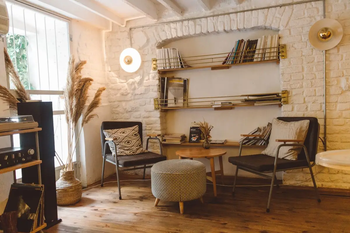
The trick to a good shelf arrangement is mixing frames with other objects. A frame, a small plant, a ceramic object, another frame. The variety of shapes and materials prevents the shelf from looking like a display case. It looks like a surface that belongs to someone.
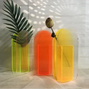
A ribbed acrylic vase placed next to a leaned frame on a console table creates a conversation between transparency and opacity. The vase lets light through. The frame blocks it. The contrast makes both objects more interesting than they would be alone.
Leaning frames also solve the problem of commitment. Hanging a frame means putting a hole in the wall. Leaning a frame means you can change the arrangement tomorrow. For renters, for people who rearrange often, for anyone who does not want to live with a permanent grid of nail holes, leaning is the better option.
On a mantelpiece, a single large frame leaning against the wall, flanked by two small objects (a candle, a ceramic dish, a small sculpture), creates a focal point that draws the eye without overwhelming the surface. The mantelpiece is already an architectural feature. The frame should enhance it, not compete with it.
The Australian mantelpiece deserves special attention. In Federation-era homes, the mantelpiece is often the most detailed piece of timberwork in the room. Pressed tin ceilings, timber fretwork, tessellated tiles. A cheap frame on a Federation mantelpiece is like wearing thongs to a wedding. The setting demands respect. Choose a frame that matches the quality of the architecture.
Frames are not wall decorations. They are objects that happen to contain images. Treat them with the same care you give to the other objects in your room, and the wall will take care of itself.
Shop Mentioned Pieces
Keep Reading
How to Style a Living Room That Actually Feels Like Yours
How to Style a Living Room That Actually Feels Like Yours Most living rooms in Australia look like they were assembled by three different…
Read article
How to Display Dried Flowers at Home Without Them Looking Like a Funeral
Dried flowers have a reputation problem. For decades, they meant one thing: dusty arrangements in your grandmother’s hallway, slowly turning grey, collecting cobwebs, smelling…
Read article